


PRODUCT DESIGN · 2026 · FLUI DESIGN JAM
Dream Creatives – 1st Place Project of FLUI 2026
LATEST UPDATE
Following FLUI Design Jam, Dream Creatives adopted our designs nearly in full, and the redesigned experience is now live on their website.
Project Details
Timeline
February 2026
3 Day Design Jam
My Role
Project Manager
Organizer
Product Designer
Tools Used
Figma
FigJam
CapCut
Collaborators
Gia Lotfi-Pour
Ubin Jung
Hidayat Patil
Overview
Dream Creatives is an AI-powered photo booth experience that aims to redefine event photography. Our team was assigned to redesign their homepage and main user flow over three days.
The Problem
Dream Creatives’ existing site was built for a kiosk, not the web. On desktop, visitors had no clear understanding of what the product was, whether it was legitimate, or what to do next.
Our Approach
When we first looked at the website, we were all confused and lost, and had no clue where to begin. We started with an audit of the site for clarity.
Initial audit of the existing kiosk-built experience
Methods
Heuristic review, user flow mapping, low-to-high fidelity wireframes.
Constraints
3 Day Design Jam, remote collaboration, and no direct access to users.
Challenge 01
Clarify the Product Experience
The Challenge
What we did
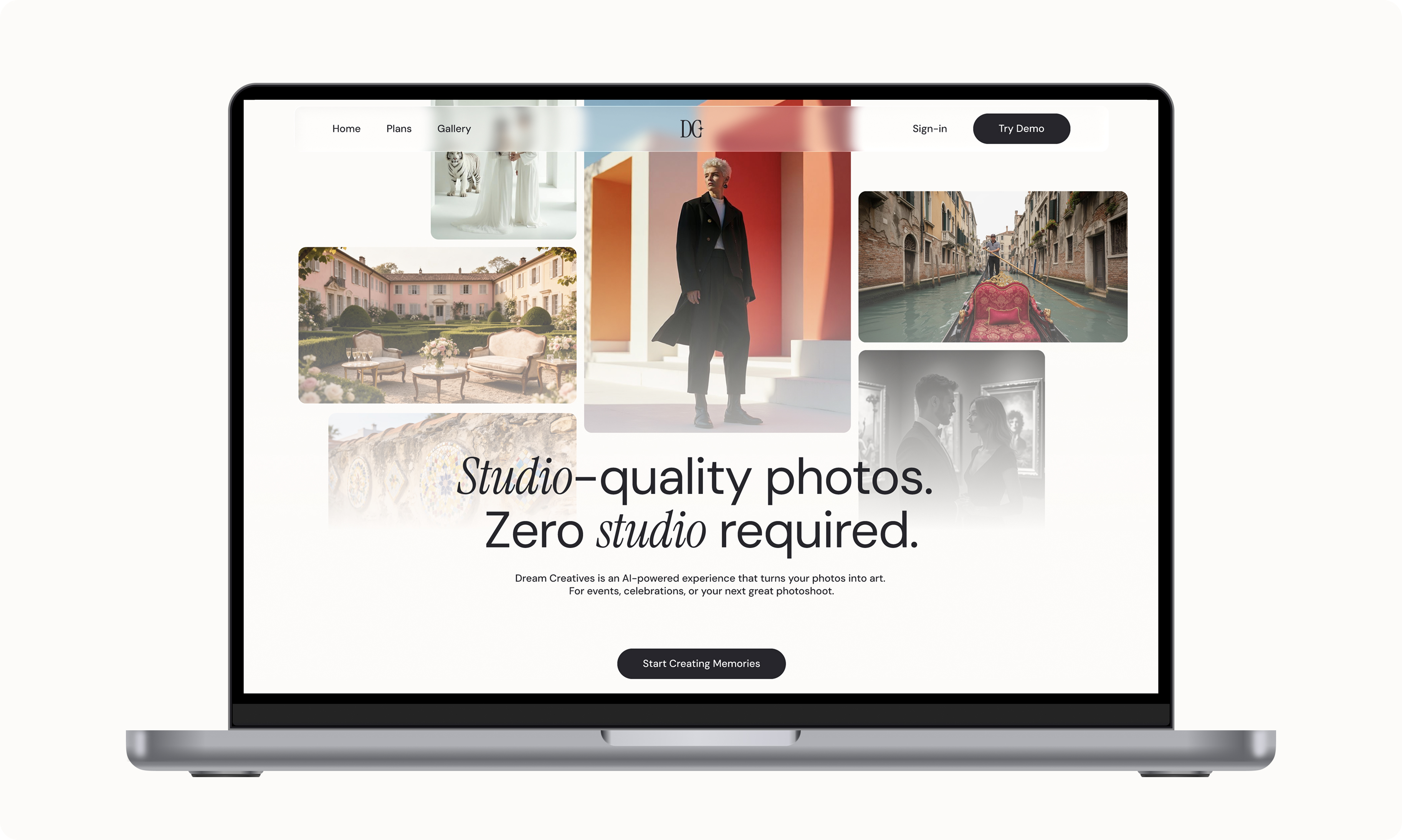
We redesigned the homepage with a scrollable layout and clearer navigation. We needed to keep in mind that the client asked for design that still spoke to both “luxury” and “corporate” users, but still welcomed new and first time users to the homepage.
Homepage redesign with scrollable layout and new design system
Challenge 02
Build Trust & Credibility
The Challenge
What we did
We added a disclaimer page, trust bar, and pricing page to help bring more clarity and understanding to new and returning users around the pricing model and how information is used.
Disclaimer page and trust bar: making data policy impossible to miss
Pricing and FAQ page: removing uncertainty before it became a reason to leave
Challenge 03
Build a Community
The Challenge
What we did
We revamped the public photo gallery so visitors can share and browse publicly, and added new CTAs and social proof touchpoints on the homepage to surface the community more prominently.
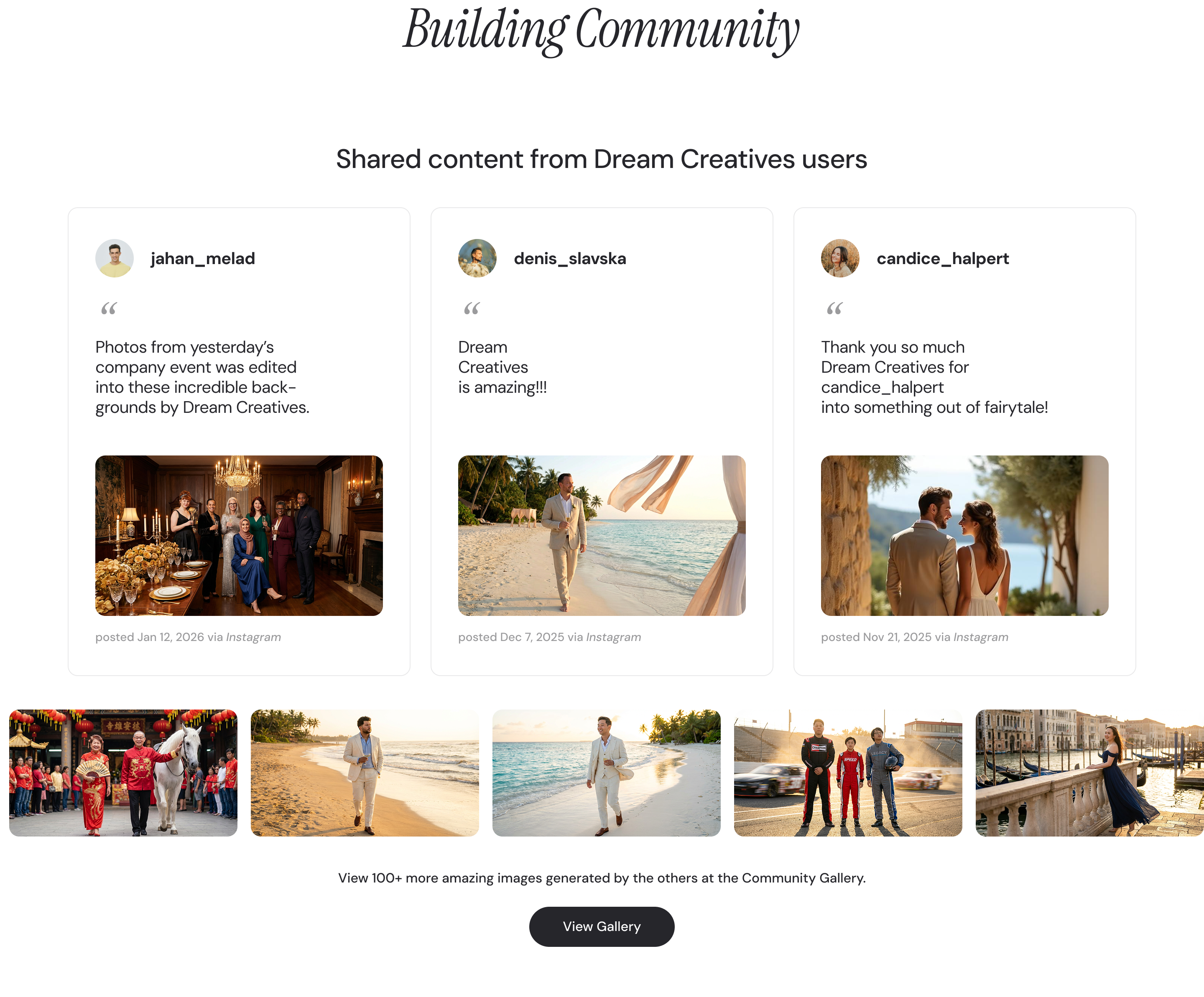
Revamped community gallery: keeping sharing inside the product, not pointing away from it
Final Thoughts
Thoughts
On the whole, this was a crazy experience for me. My friend Gia & I joined with no previous hackathon/design jam experience, and rather low expectations.
I took on the project manager role and got to work with a team I didn’t fully know going in. Figuring out how we communicated, what we each needed, and how to keep things moving in a short window was a big part of the challenge.
That being said, we had the absolute best team, and a fantastic mentor. It was such a blast, and I’ve never felt so sleep deprived in my life ;)
If you’d like to hear more about the project and the experience, I’d love for you to reach out. You can also watch our video submission here, and if you’d like to see what FLUI is, here’s the link to their LinkedIn.